
10 Checkout Changes That Will Boost Conversions
We’ve already listed in a previous blog some general best practice ideas for your site, but this list is all about turning potential customers who are already genuinely interested in what you have to offer, into people prepared to make the decision to hand over their money to you!
It’s the blight of eCommerce sites across the world. An abandoned cart signifies a sale nearly made, a customer nearly gained, but lost at the last minute. And unless they’re courteous enough – or, if they’ve done it because your checkout procedure is incredibly slow and laborious, grumpy enough –to contact you afterwards to tell you, you’ll probably never know why.
Thankfully, some serious research has been done that has revealed the main reasons shoppers aren’t finishing off what they’re starting. There’s a great infographic here that tells us that topping the list are high shipping costs and people just not being ready to purchase, but there are lots of other things that might be the cause.
The even better news is that you can do something about it, because a few relatively minor tweaks to your checkout procedure can iron out all those problems your customers are encountering. Basically, what you need to do is put yourself in the shoes of your customer and try to make the whole experience as quick and straightforward as possible.
1 Don’t ask people to create an account before they’re ready
‘Create an account’ is a phrase designed to send many potential shoppers elsewhere. And out of those who do stay and make the effort to go through the process, quite a few are going to be very unhappy about it. As one shopper quizzed in a survey put it: “I’m not here to enter into a relationship. I just want to buy something.”
That same report details how one major online company upped its annual sales by an eye-watering $300 million by simply removing the requirement for its customers to ‘create an account’ before they had even reached the checkout. Allowing them to complete what they had come to do before giving them the option to ‘enter into a relationship’ afterwards yielded a far more positive response.
2 Or just don’t tell them that they are creating one
A similar but slightly different approach was adopted by ASOS, who still got customers to register – they just didn’t tell them that that was what they were doing! It’s a fascinating story, told over at Econsultancy, and reveals that really the only difference between taking the information you need to complete an order and that you need to create an account is a password. Ask your customer for one in the right way and suddenly they become a lot more amenable!
3 If you do need specific information, say why

Getting a form right is no easy matter, as Neil Patel explains very well here. People understand that there is certain information they need to provide if they want to order an item online for home delivery. A name, an address and payment details, for example! Where they start to get resentful is when they’re asked for information that’s not immediately relevant – do you really need a mobile number, a landline number and an email address?
If you do, explain why – and suddenly people don’t mind giving it so much. If you don’t, make it as clear as you can that it is an optional field on your form.
4 Speed up the process
The fewer pages your customer needs to work through to complete a purchase, the greater the chance that they will actually do it. It may seem like a good idea to throw in an extra page plugging a related product they ‘might’ be interested in, but it could be the straw that breaks the camel’s back.
If you do need a number of pages, it can help if you make it clear how many there are, so your customer can see how much further he or she has to go. In a similar vein, there’s one company I phone occasionally which tells me where I am in their queue – that means that after a brief period monitoring how quickly the queue is going down, I can make an informed decision whether to hang on or come back later. Not knowing means you’re more likely to hang up – or give up – in frustration.
5 Clearly show that payment is secure
The security of a site, or the perceived lack of it, is still a major factor for many consumers when deciding whether to trust their credit card details to its care. People do now understand that seeing https at the start of a url indicates a secure site, but nonetheless, clearly displaying widely recognised symbols is still essential, especially on your home page and, most crucially of all, the payment screen.
It’s worth doing a bit of research to find out which site seals are the most trusted – there’s a handy blog here detailing some research in this area you might like to start with.
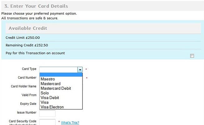
6 Provide multiple payment methods
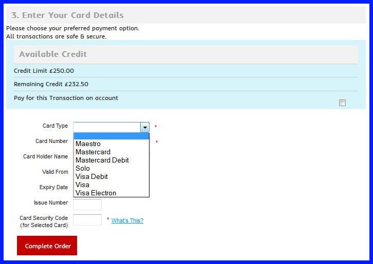
People like choice and that applies to buying on eCommerce sites just like anywhere else. Giving as many options as you can for payment method, then, naturally means you have a better chance of making more sales. Obviously, you want to include all the major credit and debit cards (don’t forget about AmEx!), but it’s also worth thinking about PayPal. For those used to using ebay in a big way and those who, no matter how many secure site symbols you’re showing, just don’t like handing over their credit card details, it’s a trusted alternative – and this blog suggests including it as an option might lead to more conversions.
Looking to the future, some analysts are predicting a move away from credit/debit cards and towards alternative payments (AP). PayPal comes into this category, but it also includes things like real time bank transfers, direct debits, eWallets, and mobile payment. Currently, the US and the UK are still dominated by card payments, with PayPal the sole significant AP representative, but in other parts of Europe and further afield, APs are becoming more current. If these are markets you’re looking to sell to, then you could do worse than check some of these methods out and look towards introducing them to your site.
7 Make call to action buttons as clear as possible
![]()
The longer your customer has to think about the whole thing, the more likely he or she is to abandon a purchase. Having large and clear ‘call to action’ buttons – such as Buy Now, Proceed to Checkout, and Complete Purchase – means you’re more likely to take advantage of the spontaneity buying online can engender in a shopper.
This counts double for your mobile site, as it seems that 88% of users say that they are more spontaneous on a mobile device with real time information. Giving them the means to indulge this tendency could pay you dividends.
8 Make your delivery charges crystal clear
The biggest gripe among internet shoppers – and the biggest reason given by them for cart abandonment – is high delivery charges. Perhaps we’ve been spoiled by huge online retailers like Amazon, who can offer free delivery because the sheer quantity of goods they dispatch each day means they can get otherwise unmatchable rates from their couriers.
The biggest crime you can commit as an eCommerce operator is to drop a delivery charge onto your customer right at the death. That really is the sort of thing that makes people give up in frustration, annoyance or anger. Having said that, no matter how clearly and how often you spell it out, there will always be a few people who won’t see it!
This blog tackles this very subject (it’s point number 5 on the list) and draws attention to how Walmart allows you to work out your delivery charge before even reaching the checkout, by entering your postcode – something you can also do in Davpack’s basket!
If you offer free delivery on orders above a certain value, why not introduce a feature onto your basket or checkout page telling your customer how much more they’d need to spend to qualify? People always like to feel like they’ve got a bargain, and this is one way of doing just that.
9 Clarity with delivery times is also important
We’ve said it before and we’ll say it again – today’s mail order shoppers are getting more and more impatient.
If you’re selling B2B, your customer normally just needs to know which day you’re likely to be dispatching their order and which day they’re likely to be getting it. Unless it’s particularly urgent, time slots are not a huge issue, because work premises will usually be staffed all day, so there should always be someone available to sign for receipt. Nevertheless, expectations are still high, and we’re really proud that around 95% of our orders – even bulky, low value goods like big bags of packing peanuts or rolls of bubble wrap – arrive the next working day, many delivered free.
Selling B2C is a whole different ball game. If your customer needs to be at home to take receipt and sign for the goods, they don’t really wanting to be waiting in all day – especially if they’ve had to take time off work. If the logistics of your particular business can manage it, offering a range of delivery options – such as fixed delivery days, ‘click and collect’ or 2-hour delivery slots – is an idea that could be the difference between you and your competitors.
10 Confirmation screen
![]()
Before your customer hits that last button – the one that completes the purchase – give them the chance to take one final look at all the key information that is making up the order. That should include: the item(s) they’re buying; the total cost, and how much of that is for delivery and, if selling B2B, VAT; how you’re taking the payment; when you’ll be dispatching; when and where you’ll be delivering.
The only other things you’ll need are large and obvious ‘complete purchase’ and ‘edit order’ buttons.
Keep the page clear and clean, with as little to distract your customer as possible.
There are, of course, lots of other things you can do – just take a look at this list CustomLogoCases have put together! – but we reckon that introducing the majority of these ideas to your checkout process could lead to a very noticeable increase in the number of sales you make. Why not tell us how you’ve improved your checkout and what features your customers have found most – and least! – helpful.
Rebecca Price
Latest posts by Rebecca Price (see all)
- The Benefits of Jiffy Bags and Alternative Products You Should Buy - 22nd September 2022
- The Importance of Warehouse Insulation - 25th August 2022
- Davpack’s Guide to Sustainable Loose Fill Packaging - 19th July 2022