
Why creating an Easter landing page could be the best decision you make this month
Whether you like it or not, these days most religious festivals have become heavily commercialised, times when savvy business owners can take advantage of gift-giving traditions to increase turnover and give their sales a valuable boost.
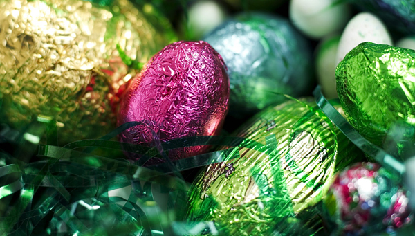
Easter may not be the rampant spendfest that Christmas has become, but it’s still a time for remembering loved ones – and not just by trying to make them double their weight with a truckload of chocolate.
If you’re running your business online, getting your share of that market can be difficult. Even if you’re earning decent traffic with your targetted keywords or your adwords campaign, turning those visitors into actual paying customers doesn’t necessarily follow automatically, and may require a bit more than just directing your potential customer to a list of products and prices illustrated by some nice photos.
People, you see, are very impatient (if you’re a regular reader of this blog, you’ll know that this is a very important thing to remember!), and if they can’t immediately see what they want, they generally don’t hang around very long to look for it.
All this counts double when we’re talking about themed promotions and special offers – why go to the effort of emphasising those products people might want to buy as Easter gifts if, when they arrive at your website, all they see is the same thing they would see any other day of the year?
It’s a bit like putting together a stunning window display in a traditional shop and then hiding everything related to it in the dingiest and darkest recesses of the store. Or if we were to enthuse about our favourite chocolate packaging, but send you to our home page where it’s nowhere to be found.
So, if you’ve attracted a potential customer to your site for something a little different to the usual, the best thing you can do is create a special landing page for them to arrive on.
What is a landing page?
Put simply, in the world of eCommerce, a good landing page does two key things: firstly, it quickly tells your visitor that he or she is in the right place to help with their initial enquiry; secondly, it clearly gives your visitor a ‘call to action’ so that he or she can take the next step, whether that means purchasing a product, asking for a call back, or signing up for further information or a newsletter.
Put even more simply, it’s a great tool for converting visitors into customers.
Incidentally, some bloggers working in fields outside of eCommerce hold that to count as a landing page, it requires a form to capture information about your visitor for marketing purposes. In our world, although an expression of general interest is always helpful, the form we’re most keen to see our visitors fill in is the one telling us where to deliver the goods they’ve just bought!
What makes a good landing page?
Of course, creating a good landing page isn’t necessarily straightforward and there’s plenty you can get wrong, as this link clearly demonstrates!
Essentially, you want to keep it as clear, clean and straightforward as possible, so that any visitor can be in no doubt what it’s about and what they need to do next. In both design and copy, it’s usually best to stick to the principle that ‘less is more’ – yes, you want to grab your visitor’s attention, but overcomplicating things is only likely to lead to people getting distracted and/or confused.
Another good piece of advice for creating the ideal landing page is that, while it certainly needs to be ‘on brand’, it should be distinct from other pages. That should even include removing the usual navigation features, reducing the chance of your visitor being distracted and going somewhere you don’t want them to.
So, if we’ve enticed someone to our site with the promise of a special Easter themed promotion, they were evidently interested enough in an Easter promotion to follow that link. The goal of our landing page, then, is to keep them focused on that initial interest, because in the end, that will mean a far better chance of making the final sale.
Don’t forget to measure the results afterwards
There are no set rules, of course, no de facto perfect landing page. What I’ve described so far is considered ‘good practice’ – a good more detail on which you can find here, but never forget that your business and your customers are unique to you. What works for an estate agent, an airline or a packaging supplies company may not work for your company.
So, when you’ve done your first campaign with a dedicated landing page, make sure you find time to study the analytics afterwards. How many people who arrived there went on to click through to where you wanted them? And of those, how many ended up actually buying something? How many left you their email address so they could get more details sent to them? And how many were there for just a seconds before they gave up and went away again?
Then, next time, try tweaking a few things – bigger ‘call to action’ buttons, more or less copy, that sort of thing – and see how the two campaigns compare. That way you can refine how you set up your landing pages after each campaign, and the more you learn the better the results will be.
And so back to our Easter landing page…
Starting with an Easter campaign is a really good way to have a first go at doing a landing page. Firstly, it has strong themes that can be easily captured in your design or imagery. That makes it easy to grab your visitors’ attention and reassure them they’re on the right path.
Secondly, while Easter is a chance to boost sales, it’s probably not a ‘make or break’ time of year – unless you’re in the chocolate business, of course. So, it gives you the chance to have a try and, if you don’t get it exactly right first time, hone your skills ready for more lucrative occasions and holidays.
It might even allow you to have a bit of fun, perhaps basing your page on the theme of an Easter egg hunt, with extra discount or free chocolate as a prize. That may go against the ‘keep it simple’ advice, but if there’s something extra to be gained, many people will usually make the effort. Just make sure your main message doesn’t get lost!
Whatever you’re doing, there must always be a first time, and the more you do it the better you’re likely to get at it. We’d love to hear about your first landing pages and what you’ve done to improve on them since, so do leave your stories in the comments section below.
Rebecca Price
Latest posts by Rebecca Price (see all)
- The Benefits of Jiffy Bags and Alternative Products You Should Buy - 22nd September 2022
- The Importance of Warehouse Insulation - 25th August 2022
- Davpack’s Guide to Sustainable Loose Fill Packaging - 19th July 2022